Trash Mountain Colors
I put together some images so Art, Camera & Costume can be aware of what each department is doing and aiming for. I know resources are tight and we all have various limitations, so no expectations for anyone to execute anything specific, but I wanted to open up a bit of dialogue.
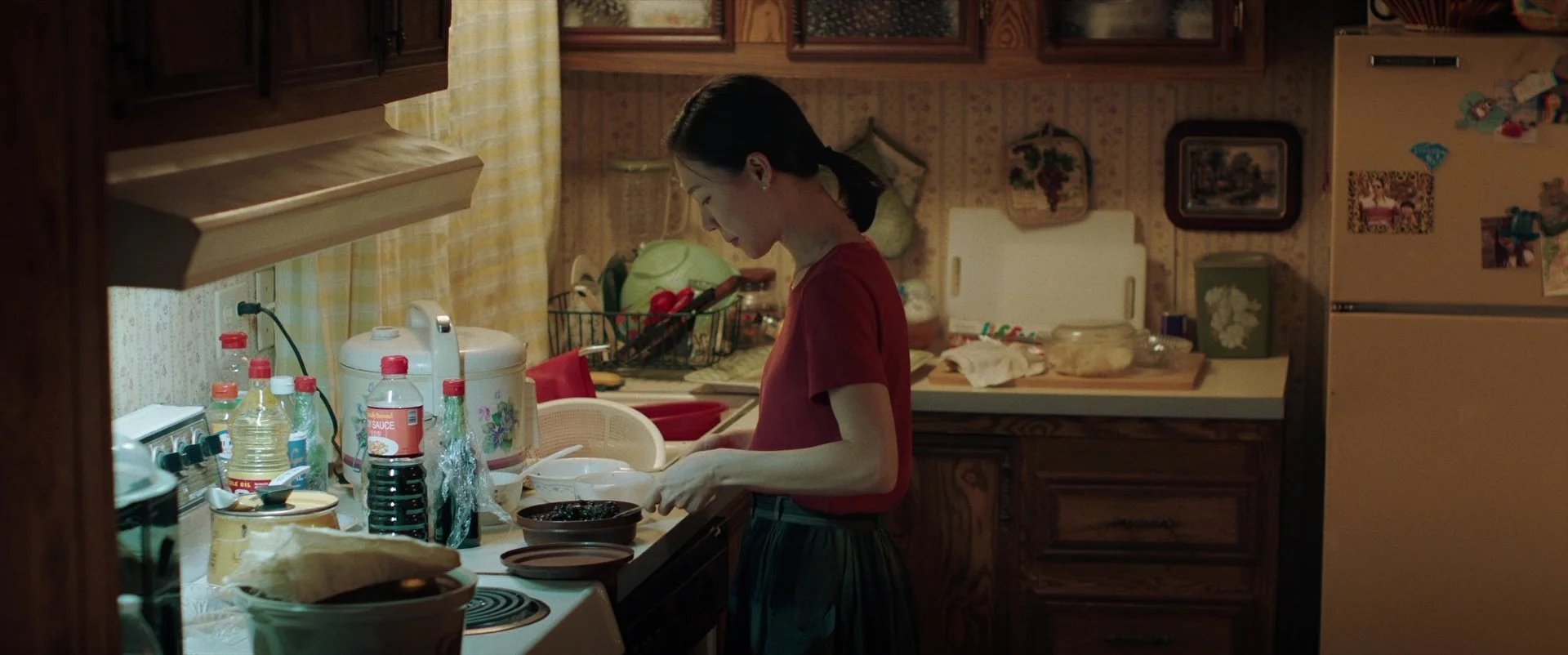
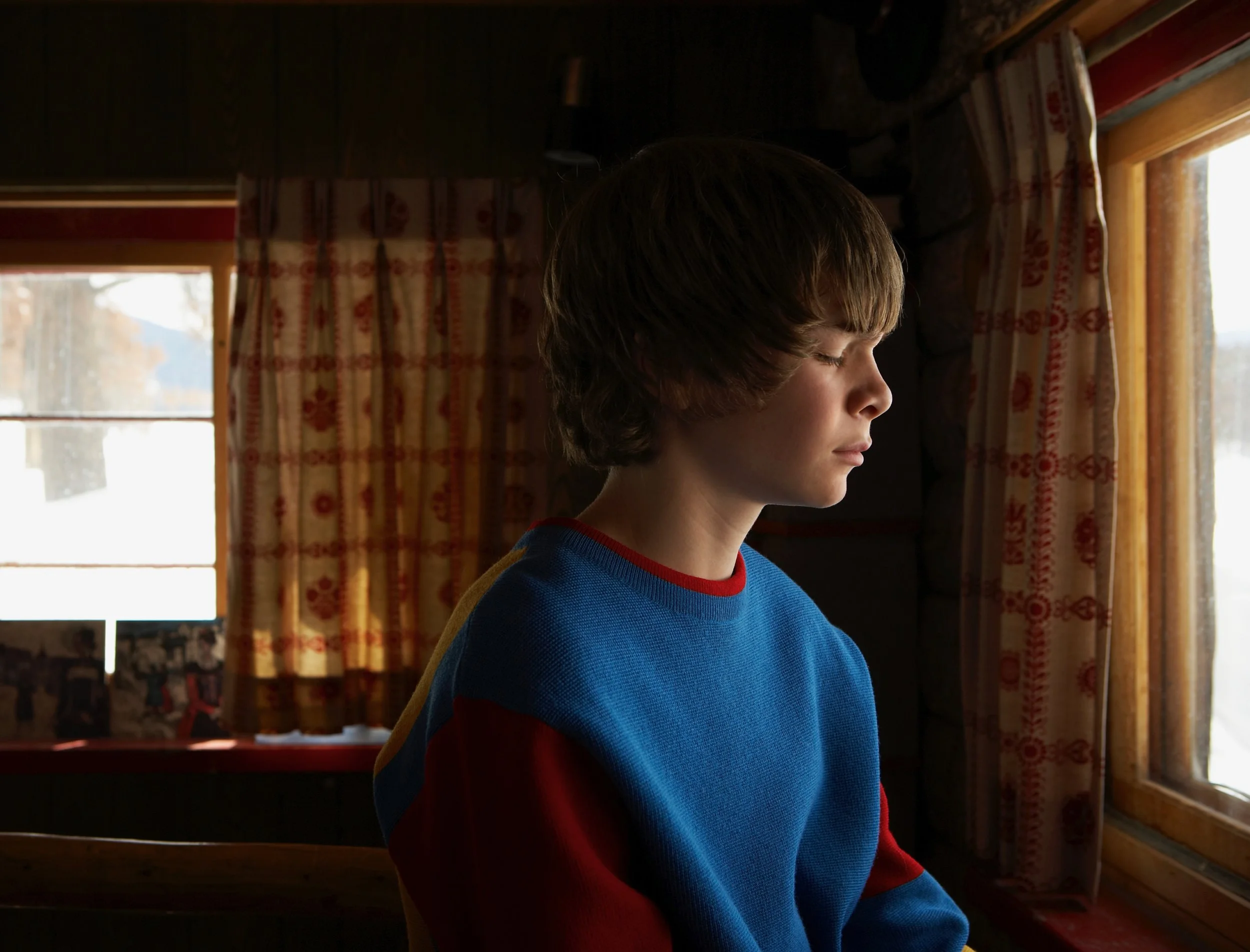
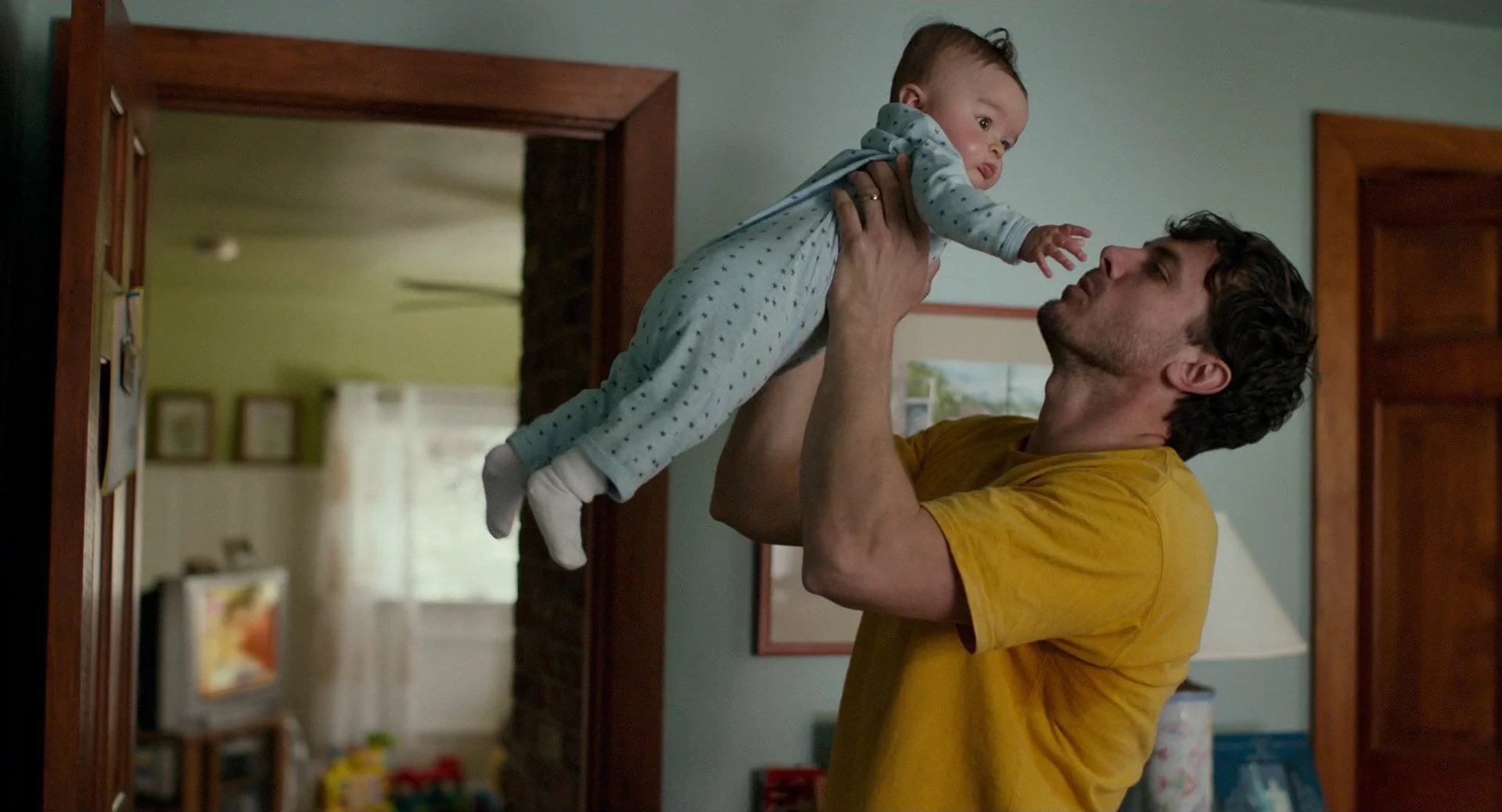
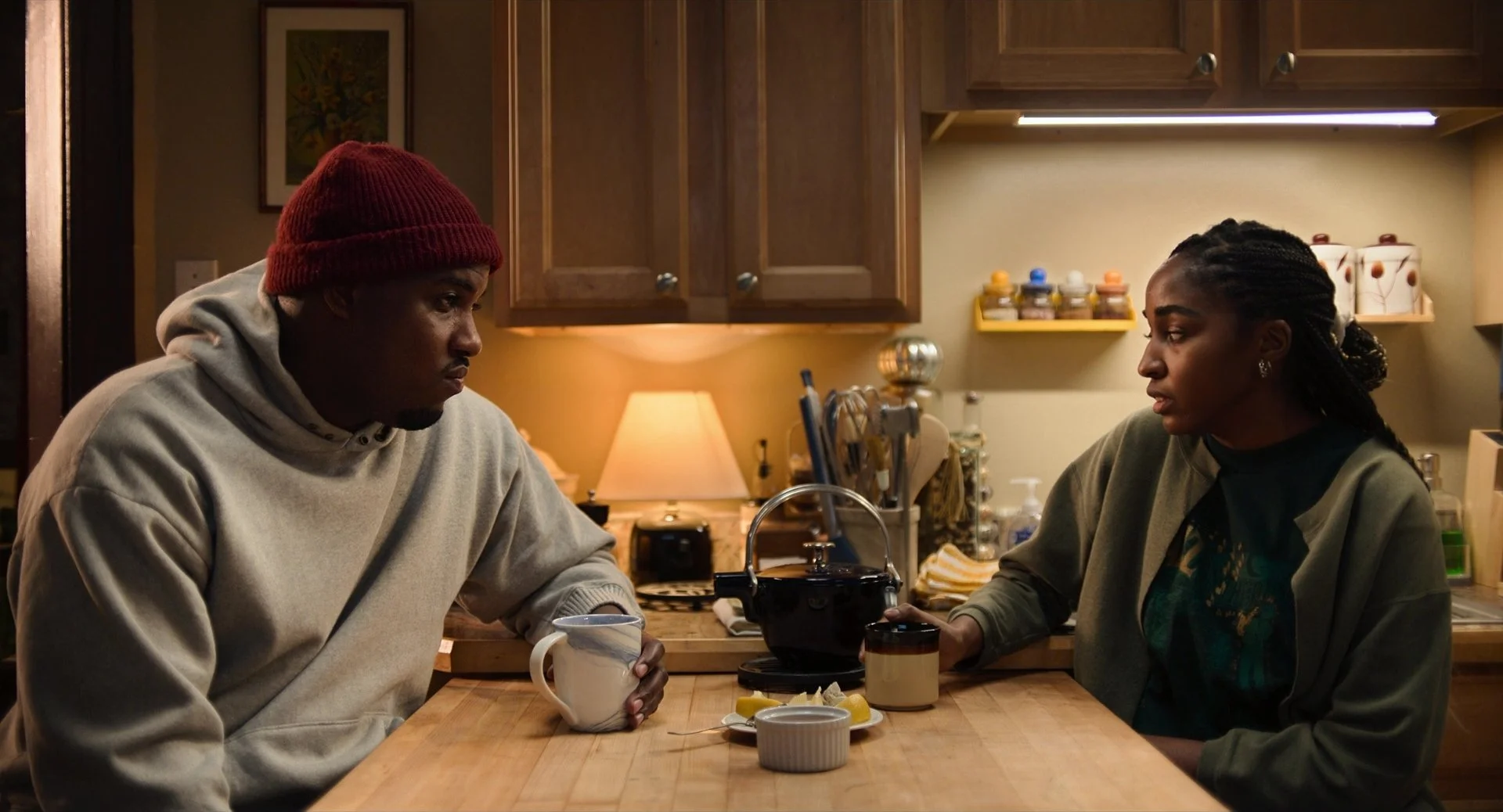
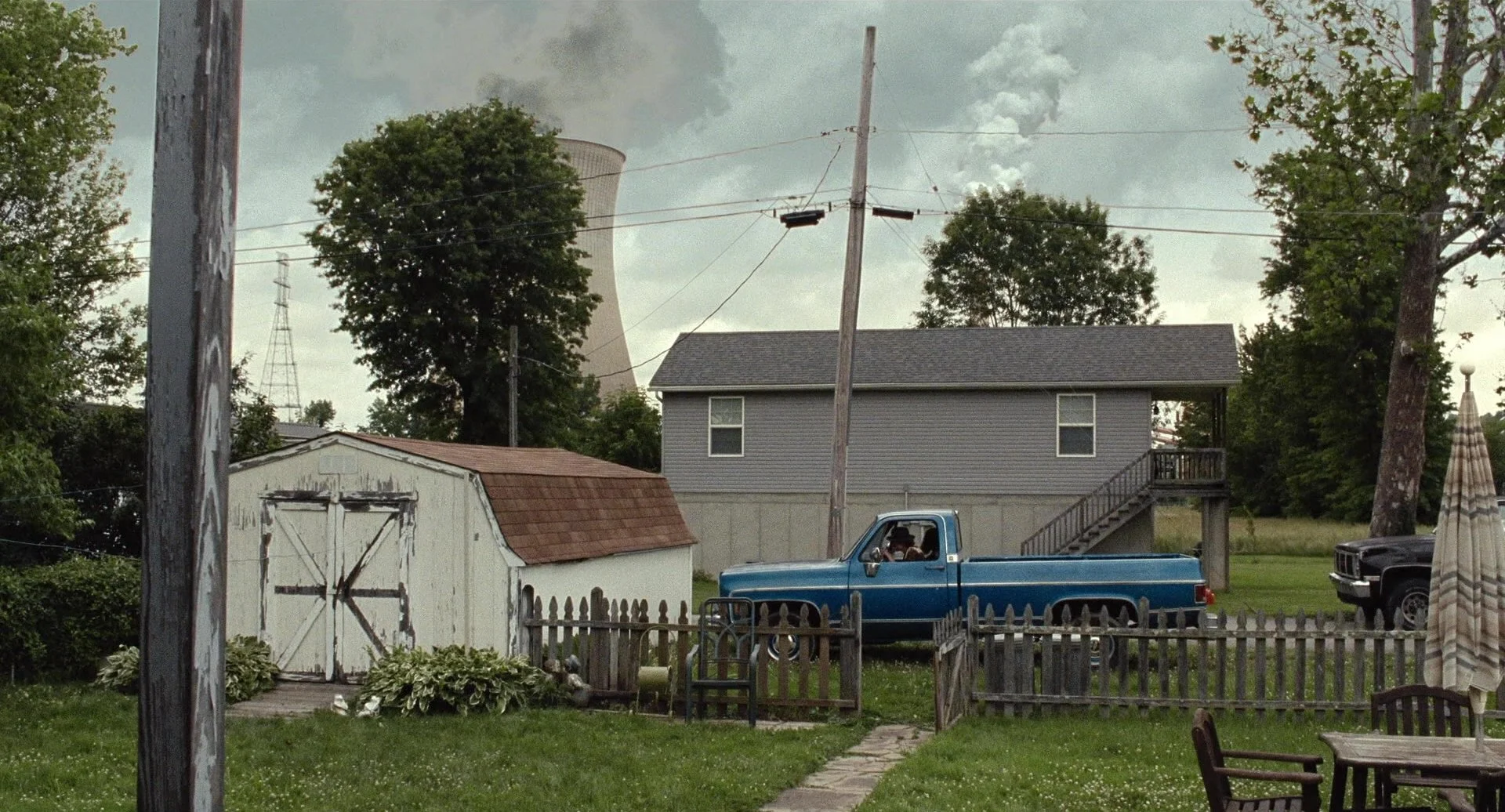
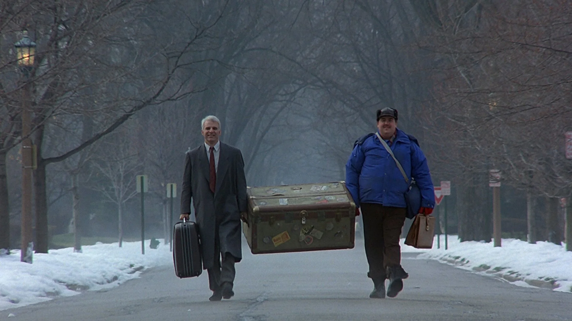
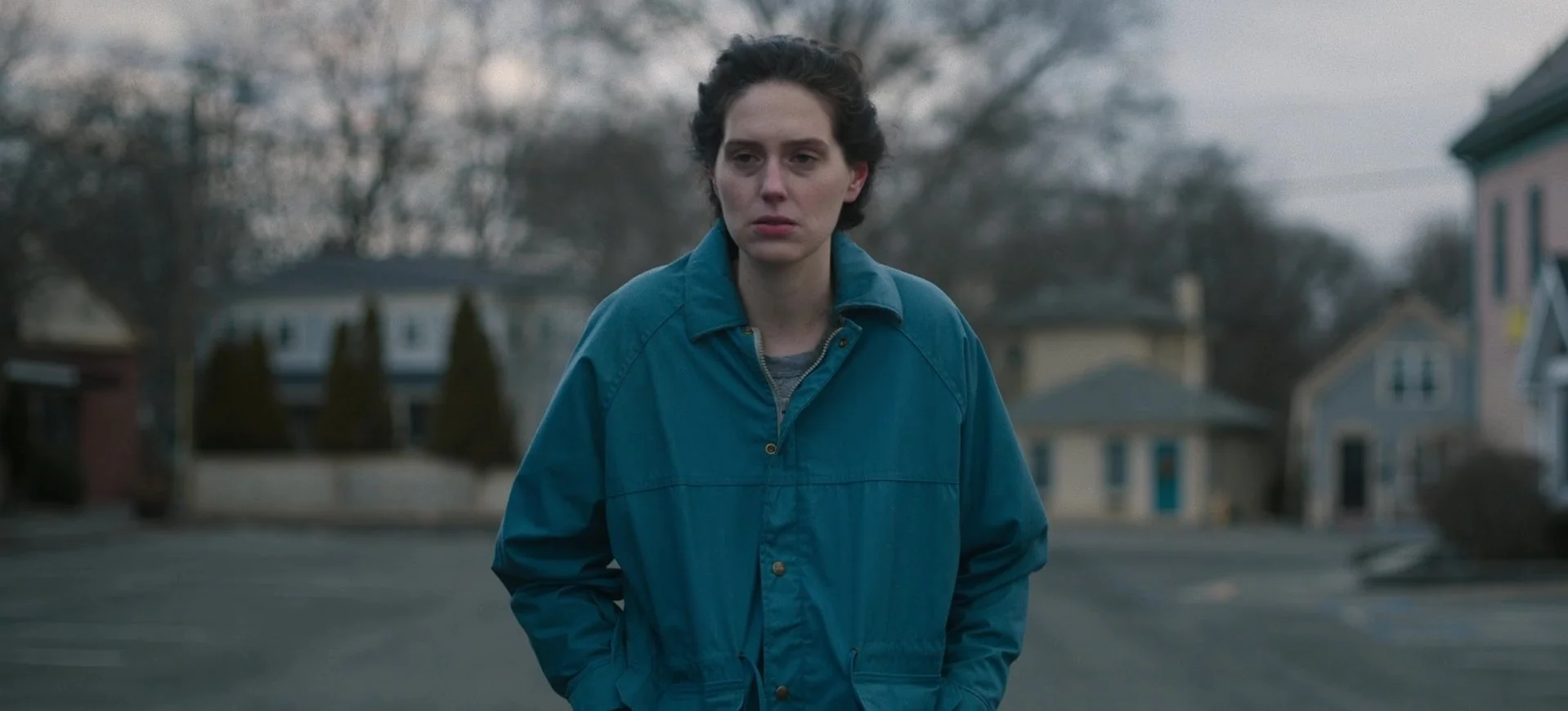
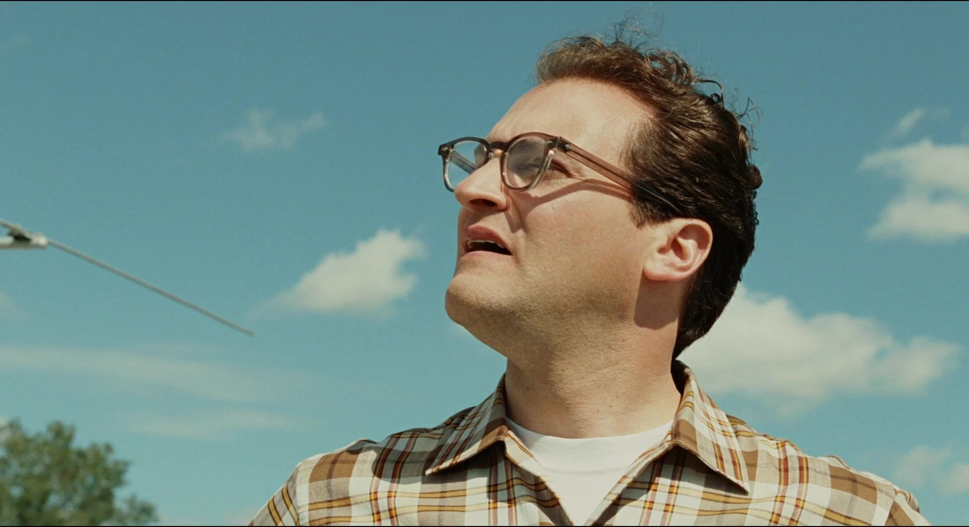
Between the season, the locations & lighting, this movie will be warm & earthy.
I want to make sure our characters don’t disappear into our backgrounds.
The below images are focused on warm tones similar to our hero locations. Matt & I were noting what colors “popped.” Between costume and Art, we noticed various shades of primary colors: Reds, blues, yellows. There’s even a bit of green below that stands out.
Jewells, I know you’ll have various other factors at play- Your own taste, the preferences of the actors, etc. I wanted to send this your way so you know where we’re at, but I’m happy to discuss any and all things.
None of this is prescriptive. Everyone should do their thing. I just want to make sure we’re communicated and know what to expect when we show up on set. I’d be delighted to talk about any and all of this.